


Oppo has quietly ditched its iconic green logo color in favor of black accents. The company has been gradually phasing out the green logo in its marketing materials for some time, and the new monochrome logo is a reflection of this trend
Before (left side), After(right side)
While some fans may be disappointed by the change, Oppo has assured them that green will still be an important part of the brand’s identity. The company plans to use the color in “interactive visual designs” to “enrich every scene where the brand meets the users.”
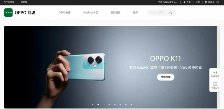
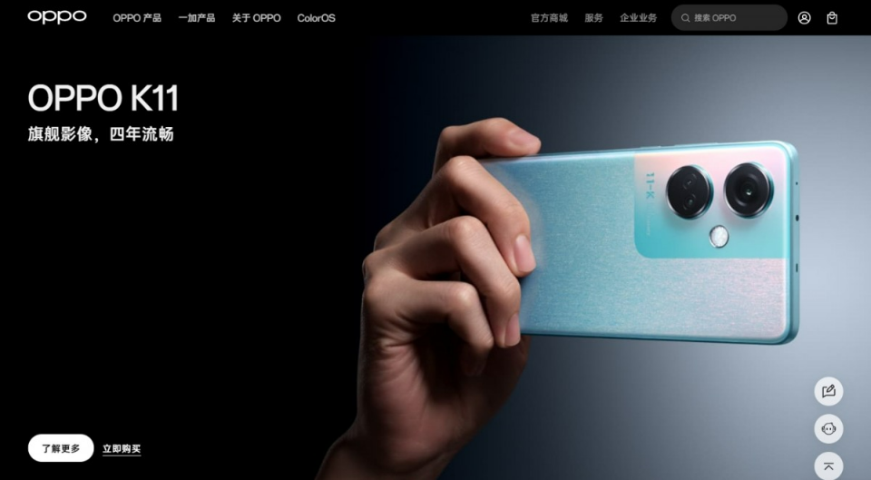
The new logo is already visible on the company’s website, where the green squircle has been removed. The pages have also been redesigned to reflect the new monochrome look.
Oppo’s decision to ditch the green logo is a bold move, but it is one that is in line with the current trend towards minimalist design. The company is hoping that the new logo will help it to appeal to a wider audience and to position itself as a more modern and sophisticated brand.